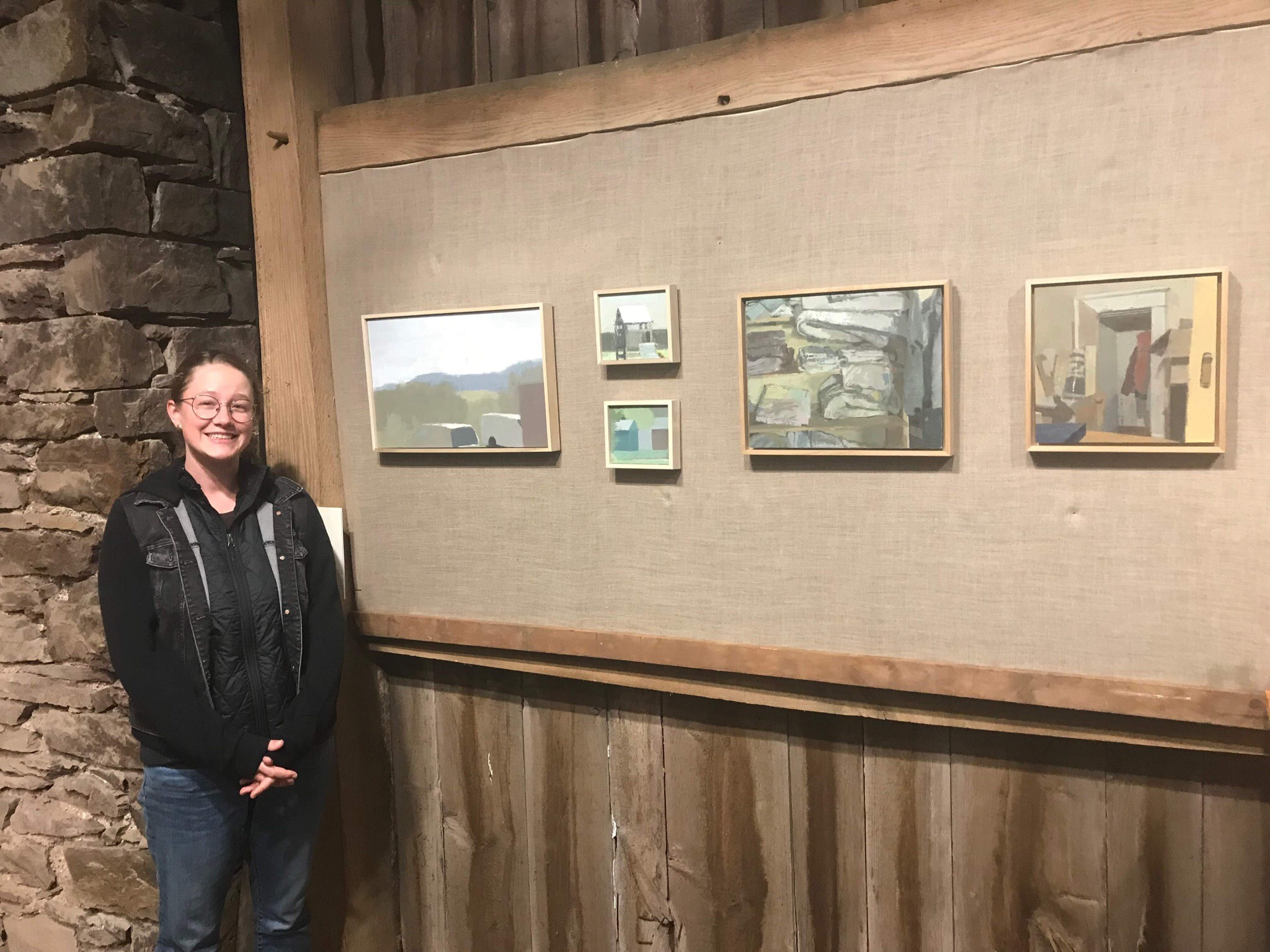
John Lee is a graduate of the certificate program at the Pennsylvania Academy of the Fine Arts in Philadelphia, holds a BFA from the University of Penn, and received his MFA from the University of Indiana in Bloomington. John is an Assistant Professor of Painting at the College of William and Mary, where he has been teaching since 2008.
His show "Arm's Length Intimacy" will be on view this fall at First Street Gallery from October 29-November 23.
LV: I’m curious about how you mix your colors, do you make them as true to life as you can? Or do you have other strategies?
JL: Hi Laura. Not quite sure how to answer the question, but its one that I think is put out there a lot in regards to looking at color. What is...'true to life', etc etc? I try to paint what I see. I do know that I am informed by colorists who work from life: Walter Sickert, Catherine Kehoe, Wolf Kahn, F. Porter, Bloomsbury Group painters, Matisse early on, Uglow, Gwen John, many others. The Arthur Stern How to See Color and Paint It book (original version 1984(6?)) was influential as well, and I use it often when teaching.
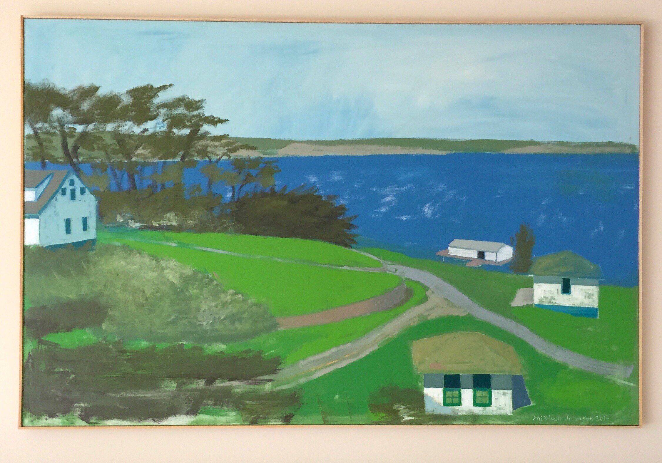
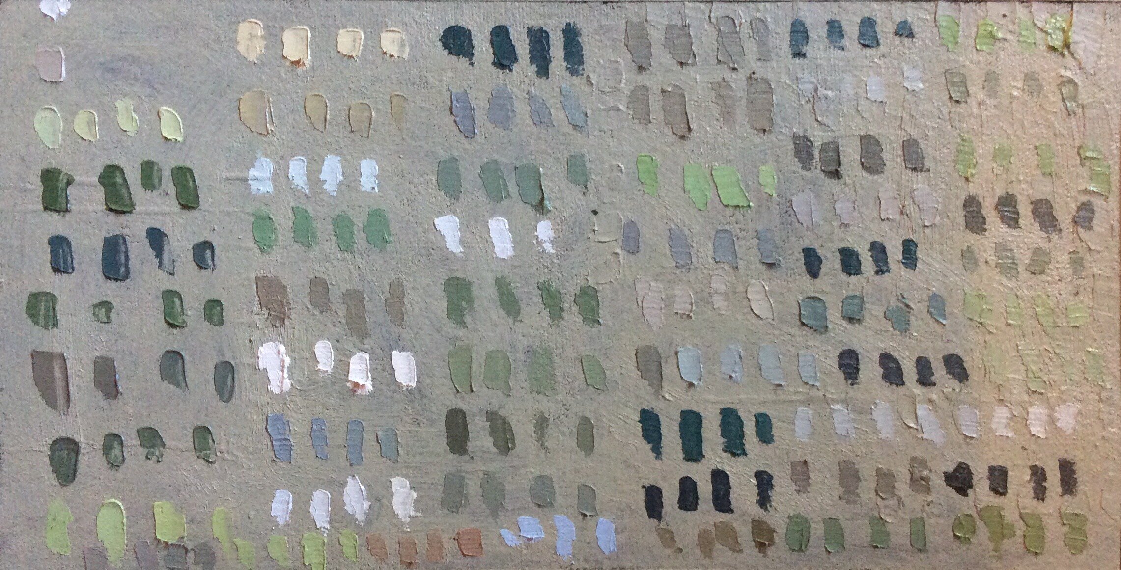
I don't think of 'lights', 'darks', 'my midtones'. I think in terms of Hue, Intensity, Value, Temperature. I strive to see the Hue Identity in every color that I see, that the color is not a neutral, a grey or brown, but is a primary, secondary, or tertiary at heart. I dull with complements, more or less. There is a focus on cad orange, permanent green, and mars violet that I have been using as the basis for my palette, but that has changed often over the years.
Do I 'exaggerate' the color? I do and I do not. It does and does not look like that in nature...the color in the reflection is -not- that pronounced. however, I see it as being a truth and sincerely based on what I see at the same time.
Harold Gilman is another painter that I like, British. I think of trying to tie the hues that I see into a value structure, getting the color (hue) to conform to the value structure. I suppose with the Stern book the ideas were:
1. mix neutrals/neutral-leaning colors using complements.
2. analyze in terms of color relationships, using the color properties: hue, intensity, value, temperature. Ask: what hue do I see (color wheel identity)? how warm, how cool, how dull, how bright (intense), how light, how dark?? Look at the relationships.
3. Try to think in terms of Hue or 'color' and 'forget value', just let the value 'happen'. I think that is the inverse of normal thinking, in that painters may let the color 'be' once the value is correct. I have a love/hate thing with color, I always think that it -could- be something else, each color...that shadow could be actually warmer, or greener, or something. Whereas value to me can be largely absolute and measurable in a sense.
LV: This is a lot to think about! Colors are so complicated. I was just doing some plein air painting today. I remember Israel Hershberg saying it was good to mix for value and hue at the same time. I find I sort of go back and forth checking for each. I haven’t read the Arthur stern book, I’ll check it out. I’ve been reading Hawthorne on painting lately. What do you think of his color spot theory? Would you say it’s similar to Stern’s book? Also what kind of paint do you use? I’m interested in looking for those three colors you mentioned I’ve never used any of them.
JL: Yes, the Stern book is based on Hawthorne's ideas. It is in some way like an illustrated version of Hawthorne (some people would not agree with that!). I was taught painting in the vein of color spots, using Stern, the Hawthorne book, and other examples.
Do you know of the Henry Hensche school? I use Utrecht and Williamsburg mostly.
LV: I have heard of the Henry Hensche School. Would you say Hensche exaggerated his colors?
JL: I like the color in his demos. I think its true color, seen through color vision....
The Leland bell book, by Nicholas Fox Weber, has long been important to me. Bell is not about 'the light' or responding to what one sees- but the movements, the rhythms, the tensions. Looking at Bell helped me to understand a lot of painting, matisse, baroque painting, Cezanne in a way.
LV: What do you mean by true color and color vision? Do you mean seeing like a painter where the visual world is abstracted?
JL: I am not exactly sure what I mean. It might have to do with knowing painters who work in terms of contour and drawing, and the paint is used to describe form using contour, value, local color (more or less), 'shading', etc. All of which would not be seeing in terms of the color, "color vision".
So I suppose I mean painting that deals with a truth to the color, letting color do the work, composing with color, and letting the color be the truth, rather than the form, the description, the object, the subject, the thing....its the color that is the goal, the concentration, even though truth to the color may obscure the identity of the subject matter. Color investigation. 'Just' looking at the color. Looking for something meaningful and true/truer in the color. "what is the true nature of the colors that I am seeing?" as one paints.
LV: You’re saying that color vision makes color the first consideration. Is that right?
JL: I suppose that my description with contour, people who maybe put contour or surface first, etc....my point is that they want something different. Gregory Gillespie for example. Very very good work, and color is I suppose important on some level, but he is about the sculptural aspects of the form, the texture, the edges, etc. One tries to put several aspects together in most cases. But I think that a lot of people may not even be desiring or even responsive to color. However, I think that when one uses color one should think of hue, intensity, value, and temperature all at once. The fact that these elements of color are somewhat contradictory, that they sort of attempt to defeat each other, is part of the beauty and tension inherent to color expression.
If you try to get those very dark colors in the shadow, or those very light colors in the light, you are easily in danger of losing the strength of the hue, or/and the intensity. For me, intensity and value are 'at war' with each other. They need each other at the same time. They work with -and- against each other. Not unlike the way that the shadows destroy the lights (and vice versa), but we need shadow in order to express light (and vice versa).
LV: Yes! I went out painting yesterday and I was thinking about Henry Hensche and getting the hue. It was pretty frustrating because I’m also really trying to get the value right. I’m not sure what you mean by the shadows destroying the lights. Do you mean that you emphasize one or the other so they don’t compete?
JL: Shadows destroying the light. Destroying may be too harsh a word. I am speaking to the idea that everything visual is a force, and is 'pushing' on the other thing...the space pushes on the form, vice versa. Horizontal to vertical, straight to curve, warm to cool. They are interdependent but also are oppositional. 'destroying' = oppositional.
